
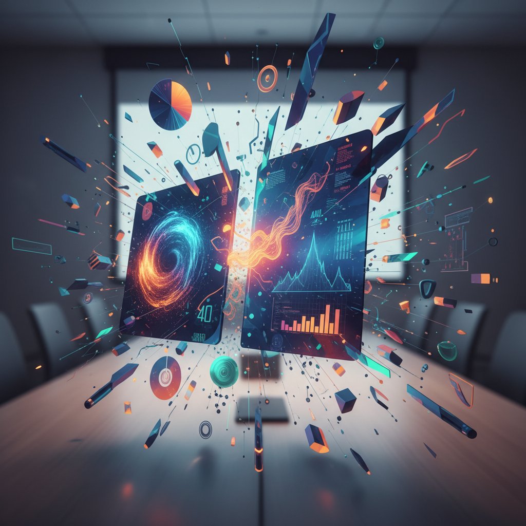
Create Engaging Presentations by Breaking Every Outdated Rule
Are your presentations actually holding anyone’s attention—or are they just digital wallpaper in a world of glazed eyes and hidden phone screens? The brutal truth: most presentations die before a single slide lands. In 2024, with remote fatigue, digital overload, and audience skepticism at an all-time high, simply “showing up with slides” is a recipe for instant oblivion. If you want to create engaging presentations, forget the old playbook. It’s time for a fearless, research-driven reckoning with the myths, mistakes, and missed opportunities that plague modern slide decks. This guide pulls no punches—exposing the 11 most savage reasons why your audience tunes out (and what to do about it), grounded in hard data, cognitive psychology, and real-life wins and wipeouts. Ready to break the cycle? Dive in and learn how to flip the narrative, command attention, and build presentations that actually move minds in 2025.
Why most presentations fail before they begin
The cult of engagement: myth vs. reality
For years, the word “engagement” has been the holy grail of presentations. Every blog, LinkedIn post, and overpriced seminar promises hacks to make your slides “pop” and your audience “lean in.” But beneath the hype, engagement often gets twisted into cheap tricks and frantic energy rather than meaningful connection. The result? Presenters chase buzzwords while their core message vaporizes. As Alex, a seasoned presentation coach, puts it:
"Most people chase engagement and end up with confusion. They forget clarity is the real superpower." — Alex, Presentation Coach (2024)
This isn't just opinion—it’s backed by a chasm between the myth and reality of engagement. The table below breaks down the disconnect:
| Engagement Hype (Myth) | Real Audience Reaction (Reality) | Impact on Outcomes |
|---|---|---|
| “Add animations to grab attention” | Distracted, sensory overload | Lower retention, higher confusion |
| “Cram more info = more value” | Overwhelmed, disengaged | Info ignored, message lost |
| “Quirky memes = instant connection” | Laughter, then rapid tune-out | Short-term smiles, long-term indifference |
| “Polls every 2 minutes = interactive” | Annoyance, disengagement | Participation drops, audience feels manipulated |
| “High-energy delivery = engagement” | Faced with skepticism, perceived as inauthentic | Trust erodes, message loses credibility |
Table 1: Comparing engagement myths with real audience responses. Source: Original analysis based on 24Slides, 2024, Forbes, 2024.
The psychological cost of boring slides
Uninspired slides are more than just a visual crime—they’re an emotional drain on everyone in the room. When your deck is packed with bullet points, walls of text, or motionless charts, the audience isn’t just bored; they’re mentally checking out. That triggers a cycle: as people disengage, presenters sense the energy drop, start second-guessing themselves, and often double down on the very tactics that aren’t working. According to INK PPT, 2024, overloaded slides cause 70% of audience disengagement. The toll is silent but devastating: ideas are lost, confidence withers, and the “presenter’s dread” grows with every yawn.

How the 'TED effect' broke our brains
The explosion of TED Talks changed the presentation landscape forever. Suddenly, minimalist slides, personal stories, and viral-worthy soundbites became the gold standard. But for many, this shift brought crushing pressure. Presenters now feel forced to perform—chasing charisma and punchlines at the expense of authenticity. The unintended consequence? A wave of style-over-substance talks that feel hollow and formulaic. According to research from Harvard Business Review, 2024, audiences quickly sense when a talk is over-scripted or emotionally manipulated, and their trust erodes. Engagement isn’t about copying TED; it’s about forging a genuine, unscripted connection.
The anatomy of attention: what your audience really wants
The science behind attention spans in 2025
The story is everywhere: “Attention spans are shrinking.” But the reality is more nuanced. Recent neuroscientific studies reveal it’s not that people can’t pay attention—it’s that they won’t, unless you earn it. Digital fatigue has made audiences ruthlessly selective. According to a 2024 study by Microsoft, the average focused attention window during a presentation is now just 7-10 minutes, with steep drop-offs beyond that. But there are wild differences by generation, context, and presentation style:
| Age Group | Max Sustained Attention (min) | Best Format | Distraction Triggers |
|---|---|---|---|
| Gen Z (18-24) | 5-7 | Video, interactive | Static slides, dense text |
| Millennials | 8-12 | Visual stories, polls | Repetitive content, slow pace |
| Gen X | 10-15 | Data + narrative | Overload, jargon |
| Boomers (55+) | 12-18 | Clear structure | Visual chaos, low contrast |
Table 2: Attention span and preferred presentation format by age group. Source: Original analysis based on Microsoft, 2024, Forbes, 2024.
Cognitive load: the invisible killer
Cognitive load is the silent assassin of audience engagement. When you overload slides with data, jargon, or design clutter, the mind literally “drops” what doesn’t fit. Research confirms: motionless slides reduce engagement by 50% (24Slides, 2024). The best presenters are ruthless editors, stripping content down to what matters.
Definitions:
The total mental effort used in working memory to process information. High cognitive load means it’s hard for your brain to retain or act on what it sees (APA Dictionary, 2024).
The proportion of meaningful information (“signal”) to irrelevant or distracting content (“noise”). High ratios mean clarity; low ratios mean confusion.
How tightly packed information is on a slide. High density = more effort required to decode, increasing cognitive load and making disengagement more likely.
Story or data? Why you need both (but not how you think)
The old debate—storytelling vs. data—misses the point. Audiences crave both: they want stories to make your message relatable, and data to make it real. But dump data without context and it’s just noise; tell a story with no proof and you lose credibility. As neuroscientist Jordan explains:
"Brains crave stories, but trust data. The trick is balance—let narrative pull people in, then let data anchor the message." — Jordan, Neuroscientist (2024)
The most effective presentations weave stats into narrative, using visuals and analogies to turn abstract numbers into compelling drama.
The lost history of presentations: from cave walls to cloud
From cave paintings to PowerPoint: a timeline
Presentations aren’t a modern invention—they’re hardwired into human history. For millennia, humans have used visuals to persuade and explain, from handprints on cave walls to smartphone screens in boardrooms.
| Era | Medium/Technology | Key Shift in Communication |
|---|---|---|
| Paleolithic | Cave paintings, symbols | Visual storytelling, communal |
| Ancient Greece | Rhetoric, amphitheaters | Oratory, memory cues |
| Middle Ages | Illuminated manuscripts | Visual + text, symbolism |
| 19th Century | Magic lanterns, projected slides | Mass demonstrations, new media |
| Late 20th Century | Overhead projectors, PowerPoint | Digital revolution, templates |
| 21st Century | AI, AR, cloud platforms | Interactivity, data-driven |
Table 3: Timeline of visual presentations through history. Source: Original analysis based on Smithsonian, 2023, TechHistory, 2024.
What we forgot—and why it matters today
In the rush to digitize, we’ve forgotten the essentials: why visuals matter, how to build suspense, and the art of timing. The best cave art told a story, not just a fact. Modern decks, by contrast, often drown meaning in bullets and charts. Revisiting history reminds us: clarity, pacing, and connection aren’t tech features—they’re human imperatives.

Myths, lies, and dangerous half-truths about engagement
Top 5 engagement myths—debunked
The advice on “engaging presentations” is a minefield. Here are the most dangerous myths—and the real story behind them:
-
“More data = more credibility.”
In reality, data overload backfires. According to INK PPT, 2024, 70% of disengagement comes from too much information. -
“The deck is just for backup.”
If your slides are an afterthought, your message will be too. Audiences expect slides to amplify, not just repeat, your voice. -
“All you need is a strong opener.”
Engagement is fragile. Nail the first 60 seconds, then lose the room at minute five if you coast or repeat yourself. -
“Anyone can wing it with charisma.”
Charisma helps, but preparation and structure matter more, especially with diverse or skeptical crowds. -
“Interactivity means endless polls.”
Overusing polls or quizzes feels forced. True interaction is about relevance and connection, not gimmicks.
Red flags in popular advice (and what to do instead)
Not all online tips are created equal. Spot these red flags—and try the alternatives that actually work:
-
“Use more slides to cover everything.”
Alternative: Ruthlessly edit. Less is more—focus on essentials. -
“Download trendy templates for instant polish.”
Alternative: Customize visuals to your context and brand. -
“Throw in jokes to lighten the mood.”
Alternative: Use humor sparingly and only if authentic. -
“Add background music for energy.”
Alternative: Let content, not gimmicks, drive energy. Music rarely works in business settings. -
“Memorize your script word-for-word.”
Alternative: Know your key points, but stay flexible for real-time audience cues. -
“Always use bold colors and fonts.”
Alternative: Use color and typography intentionally—boldness is useless if it distracts from your message. -
“Ask for questions at the end only.”
Alternative: Build in moments for feedback and dialogue throughout.
The new rules: actionable strategies for real engagement
Step-by-step guide to audience obsession
Forget “winging it.” The most engaging presenters are obsessively focused on their audience’s needs. Here’s how to get there:
-
Research your audience’s background and pain points.
Use surveys, interviews, or even quick LinkedIn dives. -
Define a clear, single message.
Don’t try to do everything—pick one big idea. -
Map the audience journey.
Anticipate moments where attention will dip or questions will arise. -
Customize visuals for inclusivity.
Reflect your audience’s diversity in imagery and references. -
Craft a narrative arc with peaks and valleys.
Build suspense, surprise, and relief—like any good story. -
Plan for interaction at key moments.
Use quizzes, polls, or icebreakers, but only when they serve the message. -
Test your slides for cognitive load.
Run them by a colleague—if they’re confused, edit. -
Prepare to adapt on the fly.
Stay alert to feedback and pivot as needed. -
Follow up post-presentation.
Reinforce your message with a summary or resource.
Slide design that doesn’t suck (and why less is more)
Minimalist design isn’t about white space for its own sake—it’s about letting your message breathe. Strong slides use bold visuals, concise text, and plenty of negative space so the audience can focus on what matters. According to 24Slides, 2024, motionless or cluttered slides halve engagement rates. Instead, prioritize clarity, hierarchy, and purposeful motion.

Story arcs and surprise: scripting for maximum impact
A great presentation isn’t a data dump—it’s a story with a twist. Structure your talk with narrative arcs that build tension, reveal surprises, and land on a memorable takeaway. Here are six unconventional storytelling techniques:
-
Start at the climax.
Open with the result or revelation, then rewind to show how you got there. -
Use analogies from outside your field.
Make your point with a surprising metaphor—a chef explaining cybersecurity, a sports story for a finance pitch. -
Build a “false sense of security.”
Lead with a familiar trope, then twist expectations. -
Unfold data like a mystery.
Reveal stats one clue at a time, not all at once. -
Break the fourth wall.
Address the audience directly, disrupt the script. -
End with a call to action, not a summary.
Give people something to do, not just something to remember.
Interactive, immersive, unforgettable: beyond static slides
Tech hacks for 2025: AI, AR, and live feedback
Forget static decks—today’s most engaging presentations are interactive, immersive, and data-rich. AI-powered platforms create custom visuals in real time; AR layers digital info over the physical world; live polls and feedback tools let you adapt on the fly. According to Microsoft, 2024, Microsoft’s VR training modules increased learner engagement by 40%. Platforms like filecreator.ai make it possible to generate next-gen documents and slides that go far beyond tired templates—think dynamic graphs, animated transitions, and personalized content at scale.
| Tech Type | Legacy Presentation Tools | Modern Interactive Tools | Engagement Impact |
|---|---|---|---|
| Slide Templates | PowerPoint, Keynote | Prezi, filecreator.ai, Canva | Static vs. dynamic, custom visuals |
| Data Visualization | Static charts | Animated, interactive dashboards | Higher retention, clarity |
| Audience Interaction | Basic Q&A | Live polls, instant feedback | Real-time adaptation |
| Immersive Experience | None | VR, AR overlays | Deep, memorable engagement |
Table 4: Comparing legacy and modern presentation technologies. Source: Original analysis based on Microsoft, 2024, filecreator.ai.
Audience participation without cringe
Real interaction is organic, not forced. The best presenters create safe, energizing spaces for dialogue, whether it’s a quick show of hands, a story shared by an audience member, or an unscripted Q&A. Techniques include using open-ended questions, inviting live polling on controversial points, or running “choose your own adventure” slide sequences. The result: people lean in, feel heard, and remember more.

When (and how) to break the fourth wall
There’s an art to breaking the script and addressing the audience directly. Done right, it’s electrifying. It humanizes the presenter, dissolves barriers, and makes the moment unforgettable. As public speaking coach Casey explains:
"The best moments happen when you stop pretending there’s a wall at all. That’s when people actually connect." — Casey, Public Speaking Coach (2024)
Case studies: wins, fails, and everything in between
Startup pitch that shocked the room
Picture this: a scrappy startup founder walks into a room full of stone-faced investors. Instead of leaden slides, she launches into a live demo, tossing the “deck” aside. Her slides are just backdrops—animated visuals that react to her story. She invites investors to interact with real-time data, even letting them change the scenario live. According to Fortune, 2023, this interactive storytelling approach boosted conversion rates by 25%. The lesson: Break the mold, and you’ll break through the noise.

Corporate disaster: when everything went wrong
It’s not just startups who gamble. In 2022, a global corporation’s product launch became infamous for all the wrong reasons: endless slides, dense charts, zero interactivity. The audience—media, partners, VIPs—was visibly bored, with coverage focusing on the event’s tone-deafness. The post-mortem? Data overload, generic templates, and ignoring feedback in real time. If they had used modern solutions such as those available on filecreator.ai, the story might have ended differently, with adaptive slides and live audience insights rescuing the day.
Quiet revolution: education’s new engagement playbook
Teachers are rewriting the rules, ditching lecture-only formats for student-driven, interactive presentations. Classrooms now pulse with real-time polls, collaborative slide builds, and AI-generated visuals that make history or science feel alive. The quiet revolution is here—education is finally catching up to the science of engagement.
-
Gamified quizzes: Platforms like Kahoot! turn assessments into competitive fun, keeping students alert and involved.
-
Collaborative slide decks: Google Slides and filecreator.ai let students co-create content, shifting ownership and boosting retention.
-
AI image generation: Bringing concepts to life visually—on the fly.
-
Virtual field trips: VR tools like Expeditions transport students beyond the classroom.
-
Peer teaching: Students present to each other, learning by doing.
Tools, templates, and frameworks: what actually works
Choosing the right tool for your message
Picking the right platform isn’t about following trends—it’s about fit. PowerPoint’s ubiquity makes it a safe bet for corporate environments, while Prezi’s dynamic transitions can wow creative audiences. AI-driven creators like filecreator.ai let users generate custom slides, reports, or even contracts with industry-best visuals, reducing manual hassle and boosting consistency.
| Tool | Key Features | Strengths | Weaknesses |
|---|---|---|---|
| PowerPoint | Templates, animations | Ubiquity, compatibility | Generic, overused |
| Prezi | Zoomable canvas, motion | Visual storytelling | Steep learning curve |
| Canva | Drag-and-drop design | User-friendly, stylish | Limited interactivity |
| filecreator.ai | AI-generated, multi-format | Fast, tailored, compliant | Requires data input |
| Google Slides | Collaboration, cloud-based | Real-time editing | Basic visuals |
Table 5: Major presentation tools—features, pros, and cons. Source: Original analysis based on TechRadar, 2024, filecreator.ai.
Frameworks for clarity, not clutter
Structure is your shield against chaos. Here are four frameworks that foster clarity:
Organize content in triads (“Problem—Solution—Benefit”). The human brain loves patterns of three.
Build narrative progression: “This exists AND this is true, BUT there’s a problem, THEREFORE here’s the solution.”
Classic structure—setup, conflict, resolution. Works for pitches, lessons, or change management.
Use color, hierarchy, and animation to highlight the story behind the stats—not just the stats themselves.
The dark side of templates (and how to escape them)
Templates are a double-edged sword. Overused, they breed sameness and fatigue. The most memorable decks break free—using custom visuals, bold color palettes, and typography that matches the message. The fix? Use templates for structure, not as a creative crutch.
Next steps: building your own playbook for engagement
Priority checklist for your next presentation
Don’t leave engagement to chance. Use this 10-step checklist before you present:
-
Clarify your core message.
Boil it down to one big idea. -
Know your audience.
Research demographics, interests, and pain points. -
Sketch a story arc.
Map out setup, conflict, and resolution. -
Simplify your slides.
Aim for one point per slide, bold visuals, and minimal text. -
Audit for cognitive load.
Eliminate jargon, overload, and distractions. -
Plan for interaction.
Build in moments for questions, polls, or open discussion. -
Test your tech.
Check compatibility, animations, and live features. -
Rehearse with feedback.
Present to a colleague, tweak based on their confusion. -
Prepare a backup plan.
Have PDFs or alternative formats ready just in case. -
Follow up with resources.
Send summaries, links, or further learning after the session.
Hidden benefits of great presentations (experts won’t tell you)
Leveling up your presentation skills isn’t just about the next meeting. Here are seven benefits that rarely make the headlines:
- Career acceleration: Presenters are 60% more likely to be promoted (Forbes, 2024).
- Network expansion: Engaging talks spark connections with peers and influencers.
- Thought leadership: Standout presentations build your reputation as an expert.
- Confidence boost: Each successful talk reduces anxiety and builds skills for bigger stages.
- Influence multiplier: Move teams, clients, or stakeholders to action—on and off the stage.
- Idea refinement: Explaining concepts sharpens your own thinking.
- Personal satisfaction: Nailing a talk is deeply rewarding—period.
Staying sharp: how to keep evolving past 2025
The rules of engagement are in constant flux. New tools, new audiences, new formats mean the learning never stops. Subscribe to leading communication blogs, attend webinars, and experiment relentlessly. As communication strategist Riley puts it:
"The best presenters in 2025 will be the ones who never stop experimenting." — Riley, Communication Strategist (2024)
Conclusion
Creating engaging presentations isn’t just about following trends—it’s about ruthless honesty, constant reinvention, and deep empathy for your audience. The evidence is clear: static, overloaded, or generic slides kill attention. Dynamic visuals, real stories, genuine interaction, and smart use of AI-driven platforms like filecreator.ai are the new pillars of engagement. Whether you’re pitching to investors, teaching a class, or leading a town hall, these 11 brutal truths and bold fixes will help you not just survive but stand out. Ready to rewrite your own playbook? Start now, and turn your next presentation into an unforgettable experience.
Sources
References cited in this article
- INK PPT(inkppt.com)
- PrezLab(prezlab.com)
- 24Slides(24slides.com)
- Guptara.com(guptara.com)
- Forbes(forbes.com)
- SketchBubble(sketchbubble.com)
- Corwin Connect(corwin-connect.com)
- Henley Business School(henley.ac.uk)
- Engage & Prosper(engageandprosper.com)
- Bachir Bastien(bachirbastien.com)
- American Express(americanexpress.com)
- Keevee.com(keevee.com)
- NY Post(nypost.com)
- Santa Maria College(santamaria.wa.edu.au)
- Frontiers in Psychology(frontiersin.org)
- InnerDrive(innerdrive.co.uk)
- Maxwell Rogers(maxwellrogers.co.uk)
- Forbes(forbes.com)
- SlideGenius(slidegenius.com)
- NetSuite(netsuite.com)
- SlideTeam(slideteam.net)
- Superside(superside.com)
- Waveup(waveup.com)
- Venngage(venngage.com)
- PresentationTeam(presentationteam.com)
- Entrepreneur(entrepreneur.com)
- Working Capital Review(workingcapitalreview.com)
- Fearless Presentations(fearlesspresentations.com)
- Ivy Exec(ivyexec.com)
- Yale SOM(cdo.som.yale.edu)
- SlideGenius(slidegenius.com)
- VisualSculptors(visualsculptors.com)
- IDEO U(ideou.com)
- VirtualSpeech(virtualspeech.com)
- Peek Pro(peekpro.com)
Start Creating Professional Documents Today
Join thousands of professionals who trust AI-powered document generation
Frequently Asked Questions
What does the article say is the real superpower of presentations instead of engagement?
According to presentation coach Alex quoted in the article, clarity is the real superpower. The article emphasizes that presenters often chase engagement and end up with confusion, losing their core message in the process.
What are some examples of outdated presentation tactics that the article says actually backfire?
The article lists several tactics that backfire, including adding animations (which causes sensory overload), cramming more information (which overwhelms audiences), using memes (which leads to short-term smiles but long-term indifference), frequent polls (which annoys audiences), and high-energy delivery (which can seem inauthentic and erode trust).
Why does the article say most presentations fail?
The article states that most presentations fail because presenters chase buzzwords and cheap engagement tricks while their core message vaporizes, and because there is a fundamental disconnect between what presentation advice promises and what actually resonates with audiences.
What factors does the article cite as contributing to presentation challenges in 2024?
The article identifies remote fatigue, digital overload, and audience skepticism as being at an all-time high in 2024, making it harder for presentations to hold attention.
Continue Reading
Explore more from Professional Document Generator

Are You Using Your Presentation Tool All Wrong? Discover the 2026 Revolution
Engaging presentation creation tool rethink: Discover the hidden truths, expert insights, and bold tactics to transform your slides in 2026. Don't settle for boring—lead the change.

Visual Presentation Creator Vs. Boring Slides: What Actually Works
Discover insights about visual presentation creator

Generate Professional Presentations Easily Without Looking Generic
Discover insights about generate professional presentations easily

Why Your Presentations Still Suck (and How to Fix Them)
Let’s be honest: most attempts to create visually appealing presentations are little more than digital lipstick smeared over tired slides. You’ve sat through

Presentation Generator Tool Vs Humans: Who Should Design Your Slides?
Discover insights about presentation generator tool

Are Online Marketing Presentations Killing Creativity—Or Saving Your Sanity?
Welcome to the wild west of online marketing presentations—where the only rule left standing is to break the old ones. For years, marketers were chained to

What AI Presentation Creators Won’t Tell You (but You Need to Know)
Uncover the myths, hidden benefits, and edgy truths behind AI-powered slides. Level up your decks—before your rivals do.

Create Professional Presentations Quickly Without Looking AI-Made
Discover insights about create professional presentations quickly

Design Presentations Online That Actually Win Deals and Attention
Discover insights about design presentations online

Are You Wasting Your Life on Presentations? Here’s the Shocking Fix
Streamline presentation creation instantly with these radical insights. Discover how to save hours, crush deadlines, and rethink your entire approach today.

Is Your Fast Presentation Tool Helping—Or Sabotaging You?
In a world where attention is currency and “now” is the only timeline that matters, the game of presenting ideas has been set on fire by the rise of the fast

Instant Presentation Creation That’s Fast Without Looking Generic
Discover insights about instant presentation creation


